Northbright Dental Studio — dental clinic website concept
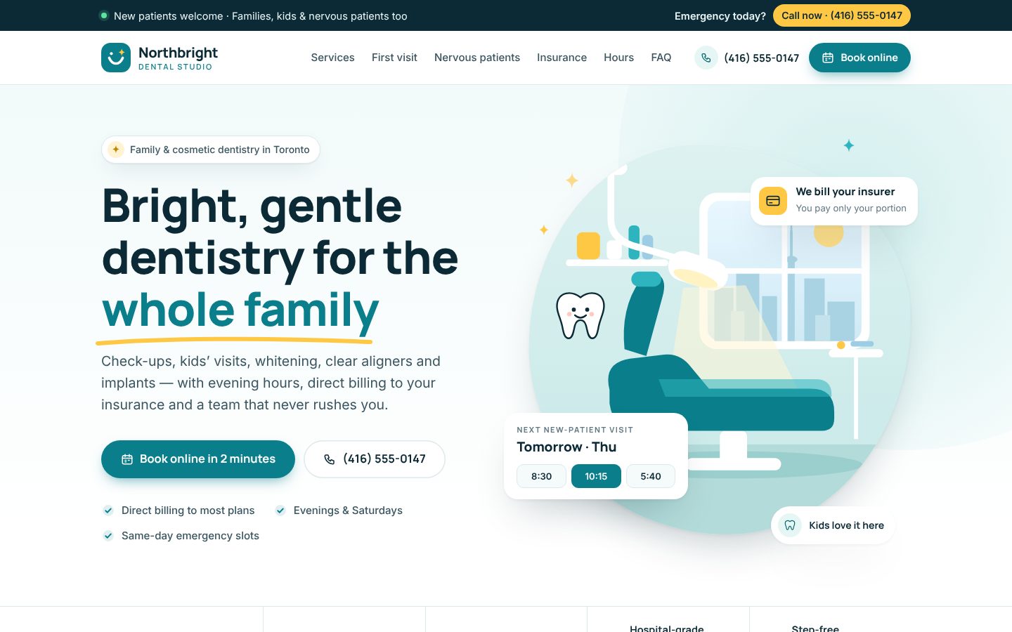
A bright, friendly concept website for a fictional Toronto family and cosmetic dental clinic. It focuses on online booking for new patients, same-day emergencies, clear direct-billing explanations and gentle care for nervous patients.
Note: Northbright Dental Studio is a fictional business. This is a concept website Newzen designed to show how we approach a website for a family and cosmetic dental clinic. It has no real patients, reviews or results.
The problem
Many independent dental clinics have websites that look dated, bury the phone number and hide the things new patients actually want to know. Is the clinic accepting new patients? Do they bill my insurance directly? What happens at the first visit? Can they see me today if I'm in pain? When those answers are hard to find, people call the next clinic on Google Maps or put off booking altogether. That happens most with nervous patients, who are often the ones who need care the most.
The goals
- Make booking the obvious next step on every screen, with phone calls a close second.
- Deal with the two biggest worries, cost and anxiety, before a patient has to ask.
- Make a small clinic look as polished and trustworthy as a large group practice, without losing its warmth.
Design decisions
We built the identity around a fresh blue-teal with a single sunny yellow accent. Teal reads as clean and clinical, and the yellow adds warmth and draws the eye to key actions. The logo is a rounded tile with a simple smile line and a sparkle. Headings use Manrope, a friendly geometric sans, and body text uses Inter for easy reading. With no photography available, we drew illustrated scenes instead: a bright treatment room with a city view and a relaxed patient wearing headphones. These feel calmer than stock photos of dental tools.
Sections that do the selling
- Emergency banner: a top strip shows "New patients welcome" next to a high-contrast "Emergency today? Call now" button.
- First-visit timeline: five time-stamped steps, from booking online to a written estimate, so the visit holds no surprises.
- Anxiety-friendly care: concrete promises like a stop signal, explaining each step first, a comfort kit and longer appointments, plus an "I feel nervous" option on the booking form.
- Direct billing explainer: a three-step card that explains how claims work, using no insurer logos.
- Cost guidance, hours and map: clear pricing language, an opening-hours card that highlights late evenings, and an illustrated location map.
Conversion features
The sticky header keeps tap-to-call and "Book online" visible at all times. The booking form asks for the visit type first, using large selectable cards for new patients, children, emergencies, whitening, aligners and implants. After that it asks for contact details, preferred time and insurance status. Every service card ends in a specific action, and the emergency card goes straight to the phone. A clearly labelled placeholder shows where the clinic's real Google reviews would appear. We did not invent any testimonials.
Mobile decisions
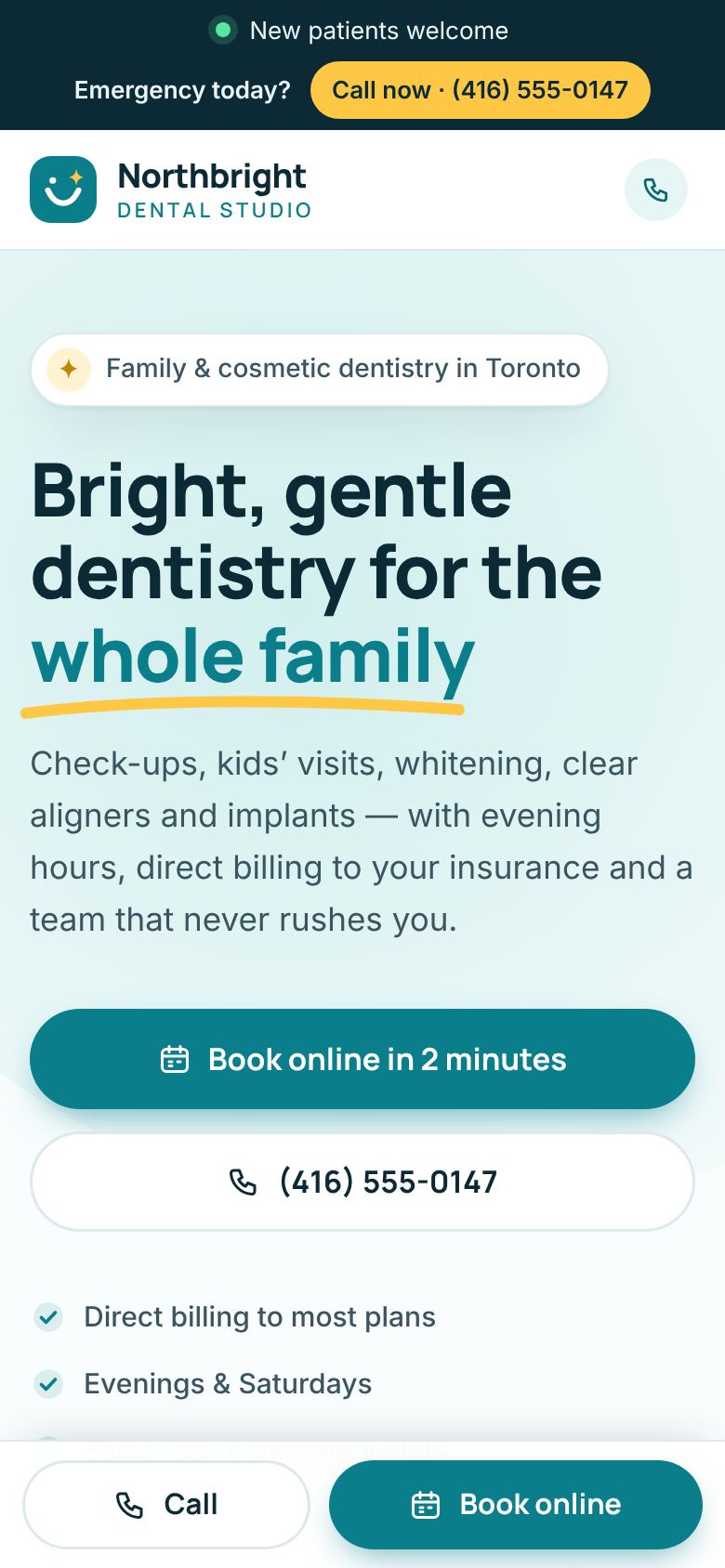
Most dental searches happen on a phone, often while someone is in pain. On mobile, a fixed bottom bar keeps Call and Book online within thumb reach. The emergency strip stays short, and the timeline turns into a vertical list. Form fields stack in a single column with large touch targets.
SEO and local SEO plan
- A separate page for each service (for example, emergency dentist, kids' dentist or clear aligners in Toronto), each with its own FAQs.
- A fully completed Google Business Profile with matching name, address and phone details, service categories, hours and regular photo updates.
- Dentist and LocalBusiness schema, plus FAQ markup, on the real site.
- Neighbourhood landing content only where the clinic genuinely serves patients, with no doorway pages.
What the real build would include
A live integration with the clinic's practice-management or online-booking system, along with secure digital intake forms. The build would also include click-to-call and form conversion tracking in GA4 and Google Ads, a live Google reviews widget, an accessibility review (AODA-minded), fast hosting, and a simple CMS so staff can update hours, fees and offers themselves.

Let's find what's costing you clients.
Send us your website. You'll get a clear, honest audit within two business days.